One of the under-celebrated talents in advertising art, is typography perhaps. Among the art directors I have worked with, there was always this special breed who wanted to experiment in everything – from the fonts to the photography. I have seen them strive to give a the ad a distinct look even if it’s a simple headline-driven ad.
Herewith some examples of nice use of typography in print ads that caught my fancy.
1. Archipelago: an electronic stock exchange that wanted to convey the idea that they have no ‘hidden information’ – a standard procedure, they claim in stock exchanges. The idea – spoof the typical psychic forecast ads.
2. Australia Post: this one has done the rounds of email forwards recently. The idea of ‘letters come alive in person’ brilliantly brought to life in typography.
Agency: M&C Saatchi, Australia
3. Ben & Jerrys: some of the executions in this campaign may be a tad hard to read but the originality of the concept in an otherwise conventional category is worth applauding. It was – this won several awards recently.
Agency: Ogilvy & Mather, Singapore.
4. Bic: the twisted humour in this campaign makes you laugh out loud. Calligraphy? Typography? Whatever – but the central idea involved going beyond setting fonts.
Agency: Jung Von Matt, Germany
5. Corrado mattress: I had written about this campaign earlier. Not just this ad, the approach to the whole campaign is laudable.
Agency: Saatch & Saatchi, Milan
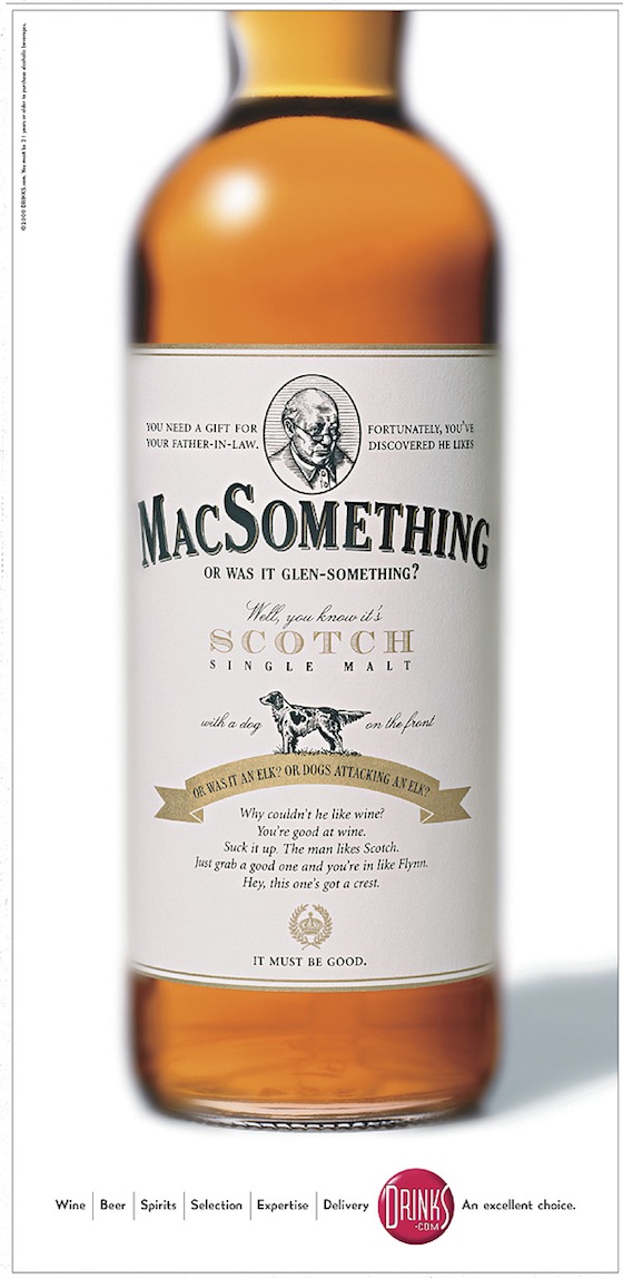
6. Drinks.com: what better way to relate to the category, than to design an ad shaped like a bottle of a beverage?
7. Drugs and driving: trippy stuff outlining the outcome of doing drugs and driving.
8. East Timor: yes, East Timor too had a campaign driving tourism.
9. Freedent: part of a 3-ad series, conveying the benefit of a great smile.
10. Humane Society: purr-fect.
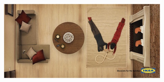
11. IKEA: part of an outdoor campaign for festive season shopping, this one makes you stop for a second to let the message sink in. Brilliant integration of the product.
12. Jazz Radio: hee-hee, love it.
13. Bellecole: class room style headline for a language learning course.
14. Malteser: brilliant art direction to send down a chilling message against drunken driving.
15. Marmite: love it? I meant the ads.
16. Mauritius Tourism: this font was ‘created’ for Mauritius Tourism. Pity that it hasn’t been retained – it could easily have been ownable.
17. Mercedes Benz: riveting copy and the font matched the conversational tone of the er…rabbit.
18. Nike: claymation meets typography and they both have fun.
19. Marston’s Pedigree: bit offensive perhaps, but hey, there is no love lost between them.
20. The Pioneer: to celebrate 100 years of The Pioneer, the idea of history repeating itself, conveyed through clever typography.
21. Regaine: ad for a hair restorer.
22. Scrabble: frankly, I didn’t get the ad, but it was a unique way of using the tiles.
23. Smart: a clever way to communicate a limited period price offer.
24. Veja: a much celebrated campaign from the South American creative juggernaut. The idea was extended in Year 2 but never matched the simplicity and edginess of this campaign.
25. Sanyo under water camera: this was perhaps the smartest line in the series.
26. Brighton Language School: is your German rusty? The Brighton Language School can help.
Hope you enjoyed the collection. In case I have missed out any worthy ones or included some not-so-worthy ones here, do comment in.


7 Comments
Awesome list, there are some real gems in there. There is nothing better than an ad that hits you to your core because it is so dead-on.
Most of them seems to be more of software skill than typography.
Raja, thanks for the comment. It’ll be great if you could share any examples of good typography that you want to share?
Some might not exactly fall into typography category, but check these.
http://adoholik.com/2008/02/16/nutrientwater-valentines-day/
http://adoholik.com/2009/08/04/st-david%e2%80%99s-centre-people/
http://adoholik.com/2009/11/07/workaholics-give-a-life-to-your-life/
http://adoholik.com/2009/08/17/cocco%e2%80%99s-cafe-speech-blurb/
http://adoholik.com/2009/07/03/sour-marbels-cave-man/
http://adoholik.com/2009/03/01/saroor-bar-rotten-luck-problems/
http://adoholik.com/2008/11/17/luxor-gloliter-pen-needle/
http://adoholik.com/2009/02/09/wellington-zoo-valentines-day/
http://adoholik.com/2009/08/10/white-ribbon-alliance-mothers/
http://adoholik.com/2008/02/20/olay/
Thanks, Bibhuti!
#1 isn't so hot, but the others are beautiful. Thanks for sharing.