The business of marketing & advertising is about persuasion. Brands aim to persuade consumers to change perceptions, switch brands or change habits. The various teams which make it all happen, have to persuade colleagues, seniors and partners into buying their ideas and recommendations. Such persuasion can happen through the written word (an email or memo) or talking one’s way through at meetings, discussions or through a formal presentation.
When I started off in advertising, formal presentations were on 35mm slides or hand written acetate sheets projected on to a screen. We then moved on to connecting desktops & laptops to show decks created on Powerpoint or equivalent. Yet, such presentations were largely to an audience in a room. Over the last few years, sharing decks via email has become common and thanks to remote working we all consume several presentations by viewing someone else’s screen on our personal computers.
There is a difference between viewing a presentation in a lean forward, one-on-one mode in a personal computer and in a group mode in a room when you are the audience among many. In the former scenario, busy or text-heavy slides can have a chance of holding the viewer’s attention. But in a room full of people having to stare at a screen the chances diminish as they are several uncontrollable factors at play: the size and format of the screen (4:3 or 16:9) and if the ‘throw’ is good enough to be legible have an impact on the last row, among others.
However, it is impossible to devote time & effort in creating two different presentations on the same topic – to cater to two different needs & audiences. Unfortunately, a ‘one size fits all’ is the most practical but sub-optimal option. I have sat in conference rooms equipped with a regular 6’x6′ screen showing slides crammed with text, graphs, infographics and animation to boot. A slide, such as the one below can be expected to hold attention if seen on a personal device but to someone sitting in the 10th row in a conference hall it is a wasted effort. The audience is likely to be unsure of where to focus and is sure to not pay attention to the speaker when the speaker is ‘explaining’ such slides.
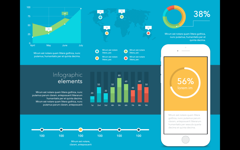
Image source: Toolbox for Keynote.
I sat through presentations from business school students recently and a common factor was this: well-designed slides (from Canva, mostly) packed with information. Another notable aspect was that most had at least 10 design elements such as blocks of text, charts, screen shots from websites and more.
My older blog posts on this topic:
10 random observations on writing & delivering presentations
Click to add title: death by Powerpoint
The ad agency presentation: Part 1 – the preparation
Meeting notes from the days before ‘sorry, I was on mute’
Whether it is the 1990s or the 2020s some presentation basics hold good. Clarity on the key messages to be delivered, rehearsal, well-designed slides relevant for the audience, impactful delivery of presentation – to name a few. Of course, not all presentations can be Apple-esque. They can afford to have those slides with one big-bold line or breathtaking image. Most of us make do with five bullet points with lengthy sentences in a slide. However we can learn how to make ‘complex’ slides look visually interesting.

The world of business & academia understand the need for good impactful presentations. In a world where such presentations need to deliver both in lean-forward one-on-one presentations (without any commentary or explanation) and in large rooms filled with a passive, distracted audience, the basics need to be re-visited. Slide content, design and delivery – relevant to the audience are all important. A blog post on specifics follows. Another important aspect to consider in the digital world is video – presentations are no longer only about slides. Meanwhile, do share your views on presentations in a hybrid world.


