Most of us display the ‘those were the days’ attitude when we witness trends which are different from what we once used to like. New age music, movies and popular culture is always compared to ‘what once was’. Advertising too is no different. One might argue that everything changes with the times and reflects the current social context. Advertising is no different and is also reflective of the influence of technology and media consumption habits. So it may not be fair to compare creativity of today with that of yesteryears – what was relevant then, may not be so now. However, the fundamentals of creativity for business problem solving will be the same forever. The need for a creative idea, focused message, relevance to the target audience, charming them into noticing & receiving your brand message, good use of the medium or platform – these are timeless traits.
Print advertising is one domain, however, which was clearly better back in the days. The one big difference: craft. Most print ads in English, especially in markets like India seem to approached like a chore – something to be dealt with quickly with as minimal effort as possible. So we have a straightforward feature-as-headline, bullet-points as copy approach with no attempt to charm the reader into buying the brand argument. The most common justification for this approach is to believe that consumers won’t ‘get’ clever messages or that they need to be told the proposition upfront without any embellishments as ‘consumers don’t have time’. In fact, the cluttered media environment is precisely the reason why brand communication needs to be interesting – to stand out from the clutter. Another new-age phenomenon to contend with is that end-consumers are producing highly creative work on their own – just look at the hilarious memes across social media. Brands are actually competing with that creativity – not just with competition.
In this context, here are a bunch of print ads from 2005, sourced from Epica Awards. The common traits: a creative idea, high levels of craft, copywriting which brings a smile and charms the reader. Another hallmark of the ads is that they do not explain it all – the reader is left to ‘connect the dots’ to complete the message.
Power of press
Advertisers believe ‘bigger the ad, bigger the impact’. While there are examples to prove otherwise, a full page ad in a newspaper is a great opportunity. This print ad dramatises the impact of a full-page print ad especially for launches or to make big announcements.

Harvey Nichols: calendar
Super-premium and luxury brands have an irrational appeal – consumers desire them triggered by what the emotional brain wants. This Harvey Nichols ad captures it with a sense of humour – conveying the extent to which someone will go through to buy the brand. The ad takes a self-deprecating humour route to convey the effects of its price tag.

John West: straight from the ocean
A visual pun to convey waves seems like a natural fit for the claim of a brand of sea food.

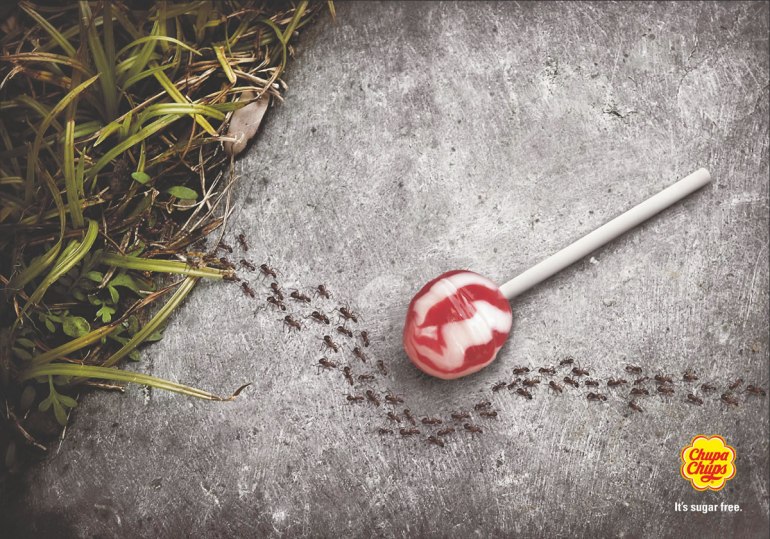
Chupa Chups: sugar free
Among the laddering techniques used to create ads is to stretch the benefit accruing from the product feature to an improbable level; ‘a breath mint so cool it feels like the Arctic in summer’ – as an example. Here is a variant of the approach presenting a ‘negative’ effect of the benefit.
Club Med: travels
This is perhaps another example of intriguing readers just a little bit to make them wonder what’s going on and then have the penny drop moment.


The Loch Ness Marathon
Baxters is a Scottish food processing company. They saw an opportunity in associating themselves with the Loch Ness marathon and avoided a cliche.

66°North: clothing brand for Iceland
A simple, yet effective way to showcase the double benefit of a clothing brand – extreme weather resistant and fashionable enough for everyday wear.


inlingua: language centre
There have been variations of this idea in this category across brands. But still works like a charm.


BMW: new generation
‘Introducing the new <insert brand and model name here> is the common template for automobile ads nowadays. Meanwhile there are other ways to convey the same message in a memorable fashion.

Volkswagen: mini van
The category is used largely by those who need a large load to carry around and hence the portrayal of the buyer. But still conveying the possible downsides of using the product is a different take.

Gillette: British Rugby
Tactical ads can weave in a thematic message too – this ad from Gillette announcing their association with British Rugby shows. Also, the idea and the execution is top class.

GameBoy: obsession
How addicted can you get to GameBoy Advance? This addictive.

Bosch: cordless drill
The disadvantage of having work with an ‘inferior’ option to a cordless drill is dramatised in these set of print ads.


Yellow Pages: range of services
So this was back in the days when people still relied on directories like Yellow Pages to find businesses or services they want. Here’s a visual representation of the diverse services. Imagine the effort that went behind identifying the services and crafting a suitable composite visual to highlight the idea.


Which one was your favourite? Do comment in.


